Nov 12 2008
Rubbernecker Blog challenge 9 – an inspiration
It’s my honor to hostess the Rubbernecker Blog challenge this week. I thought it would be fun to do use an inspiration piece, and I chose a beautiful piece of art that I found while browsing Art.com. It’s an amazing abstract by Dee Ott called Summer Fern II, and can be seen (and purchased) HERE. Be sure to check out the Rubbernecker Blog for all the details of the challenge.

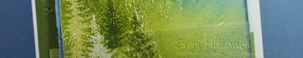
My card came together strictly by experimentation. I knew the look I wanted, but I wasn’t sure I could achieve it. My first step was to emboss the larger pine tree from my Kittie Kit Scene #2 – The Moose is Loose stamp set in clear EP on white cardstock. Then I sponged on some Adirondack Willow ink. I stamped the tree again in Lettuce ink and clear embossed it. A smaller, and less full, tree was cleare embossed to the left and behind the first white tree, then stamped again in Lettuce twice without reinking and clear embossed again.

Maybe you can tell that I really liked the progression of color in the Summer Fern II art piece and tried to replicate that in my card. After the trees were stamped and embossed, I started sponging. I used Lettuce behind and around the trees, Juniper on the lower right, and Cloudy Blue for the sky. The water is Stonewashed. The rest of the sky was sponged in Cool Peri, Shell Pink, Peach Bellini and Lemonade.
THEN, I spilled some clear embossing powder onto the card!!!!! I almost panicked, because the inks were still wet from sponging and the powder wouldn’t just fall off. So instead, I just reheated the entire card and it resulted in a very cool textured surface as opposed to what would have been a flat surface. Here’s a close up (you can click on it to see it larger):

I hope you’ll visit the Rubbernecker Blog for links to the Design Team’s inspired artwork too!

*********************
Stamps: Kittie Kit Scene #2 – The Moose is Loose (trees), Sentiment (53-02) from the Winter Holiday section
Paper: white, greens, brocade blue, acetate
Ink: Memento – tuxedo black, Ranger Clear Resist pad, Adirondack dye inks: willow, lettuce, juniper, cloudy blue, stonewashed, cool peri, shell pink, peach bellini, lemonade
Accessories: clear EP, Cuttlebug Just My Type folder, brads, Cut N Dry stamp pad felt
Items available from Rubbernecker Stamp Co.
17 responses so far


The card turned out beautifully and the texture makes it look even better.
Oh, my, Broni, this is stunning!!! I love how you blended all the colors and sometimes a little accident results is something wonderful…which in this case is sooo true!!! I feel a tutorial coming on…heehee!!!
Check out your site from Tammy’s blog. She’s Awesome. Your card is absolutely beautiful. The extra EP took a stunning card to POW, — you are very inspiring!!
Wow, that’s gorgeous, Broni!! I love the blended colors and textures!
Gorgeous card! Love all the colors!!! And I amazed how a little accident gave a beautiful result!
Beautiful inspiration piece, and stunning card! I love those colors and pretty pines!!
Wow, happy accident! The texture is really nice! I love all the soft colors…reminds me of the Aurora Borealis-gorgeous scene!
Broni,
Your card is beautiful! And, you know what “they” say … there are no mistakes, only happy accidents! I think your card looks gorgeous.
Gorgeous card! I love the colors you used and the embossing powder really adds a special touch to it! Great job, Broni!
The blending of the colors look great.
This is just gorgeous! I love the extra EP on it. sometimes those happy mistakes are the best kind!
Gorgeous Broni, love the texture!!
You make the best *mistakes*!!!! I wish my spills could end that happily!!
I really like the sky!! It is so dreamy! It reminds me of when I lived in the mountains of Western NC.
oh my..This is so wonderful, Broni!!! absolutely wonderful!!!!
This is so pretty Broni! I really loved the inspiration piece too!
This is outstanding. Beautiful creation. Love the texture.
Oh, my GOSH!! This is SO BEAUTIFUL! I love the colors and I know how you like the blue and green combo–it shows because you use it so well. The embossing makes the image extra special. This is just gorgeous, Broni!