Aug 27 2008
Color Throwdown Challenge #8

Well, if it’s Wednesday it must be time for another Color Throwdown challenge! I’ve been having the best time with these color challenges. And this week Tammy has chosen the prettiest color combination. I just love it!
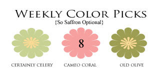
How pretty are these colors together?? Gorgeous! I can’t wait to see what the other girls have done! And you should play along with us too. Just post your card using these colors (or close relatives) to your blog or SCS and then link it directly to today’s Color Throwdown blog post.
So here’s my card~

I absolutely fell in love with the whimsical papers in the new Basic Grey Offbeat 6×6 paper pad. I love the colors and the funky images and graphics! Would ya look at those cute beets and how about the dragonflies on this paper! Cute, I tell ya!
I started with a base of Prism’s Prismatic Intense Kiwi, then layered ruby red and the Offbeat paper on that. The image from Inkadinkado’s Garden Delight clear stamp set was colored with Stampin’ Up markers and stamped onto the white cardstock.
The dragonfly from the same set was colored the same way with certainly celery and old olive markers. After I cut it out with a circle Nestabilities die, I stamped the sentiment using PTI’s Mixed Messages set, then matted it on a circle of celery cardstock and pierced around the edges of it.
I rounded all the corners on the right side of the card and the dragonfly circle is attached with foam mounting tape. This layout is based on the Verve sketch MTVD07.
Here are links to the other ladies’ blogs so you can see the details of their creations:
So ends another Color Throwdown challenge card post! Please come back again soon!

~~~~~~~~~~~~
Stamps: Garden Delight – Inkadinkado, Mixed Messages – PTI
Paper: white, ruby red, certainly celery, Prismatics Intense Kiwi, Basic Grey Offbeat 6×6 pad
Ink: certainly celery, SU markers: old olive, certainly celery, cameo coral
Accessories: circle Nestabilities, corner rounder punch, 5/8″ grosgrain ribbon, piercing tool & mat, mounting tape
16 responses so far


GORGEOUS! Just GORGEOUS!
Broni, this is beautiful! I love what you did with these colors! The branch and dragonfly looks so neat, and that designer paper is a perfect compliment!
GORGEOUS! I love how you mixed the Offbeat with a more elegant image….I’ll have to break out that paper tonight!
Your dragonfly is amazing, gorgeous card Broni!
Oh Broni this is so pretty! I love that whimsical paper too-beets and dragonflies, who knew they went together?!
Great card. I agree wonderful color combination. I don`t have the coral one so I`m out this week.
This is so fresh and beautiful, and I love the images you’ve used!! Such pretty papers too!!
Gorgeous!!!
so pretty – what a soothing card! tfs
This is just beautiful!
I love the delicate blossoms alongside this wonderful dragonfly!
~Bev
Oh MY Broni….this is stunning! I LOVE the colors. So soft, so beautiful!
Broni, this is absolutely delightful! Love the dainty stamping and the coolest dp…have to check it out!
Amy
Beautiful Broni, love that DP!!
BEautiful….love that paper—you tied the image into it so well! Great card!
Georgeous Card! I love this card, Great Job!
Love your whole card, but those stamped images are wonderful beyond belief!